
Where did the Nico logo design originate?
25 May 2024I put together a logo of my name soon after I chose my name itself. It looks like this:
 This is my logo thing.
This is how I put it together.
Nico Rosberg
Lewis Hamilton and Nico Rosberg made huge waves en route to Formula One and were very exciting junior drivers at the point where I was first watching the lower rungs of the single-seater ladder. Rosberg was one of the influences on my choice of name and so I did look to him for ideas for a design. I wanted to reference my appreciation for his achievements but with an individual twist.
You can see Nico Rosberg’s logo on the cockpit of this Airbus, replicating his helmet design. The N and I are not connected, and the O has a break in it mirroring the C, but the proportions and concept are similar.
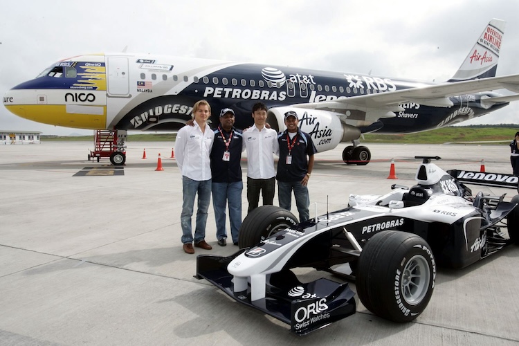 Nico Rosberg’s Williams era helmet design, on an Airbus.
This wasn’t actually the first thing I considered for my own design, but it’s the first thing F1 fans will spot.
Sony Vaio
I primarily took inspiration from the Sony Vaio logo. There are plenty of good articles discussing this design, such as here. Essentially, consider the VA as a waveform representing analogue signals and the IO representing binary code and therefore digital signals.
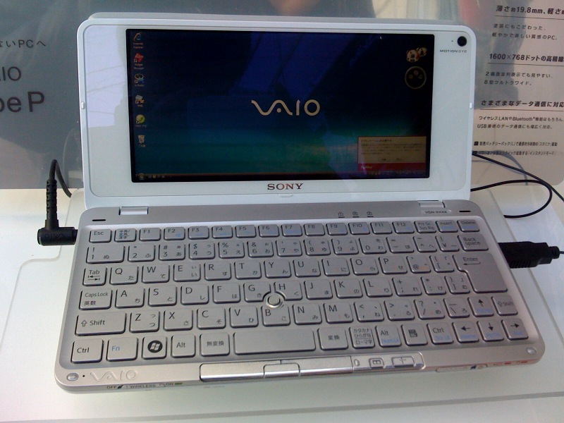 VAIO P series, Yoggy from Yokohama, Kanagawa, Japan, CC BY 2.0
This resonated with my own background, as a one-time photonics student turned musician, or as an artist and engineer.
The geometry
I created the original sketch in a maths education package called Cabri-Géomètre. The O and C were simply overlapping circles (by the full width of the character at the intersection) with the gap in the C character the circumference length of the difference in radius between the inner and outer edges.
The width of the N was four times the width of each stroke, i.e. the white space between left and right leg of the N was double the stroke. Originally the I was the same distance on from there (and therefore the curve linking the N and I matched the top of the N) but this looked super weird so I halved it.
Everything looked a bit precise and weird, so I took a screenshot at low resolution, upped the contrast, smoothed the resulting image, then used an online SVG converter. Then there’s a few little tweaks directly in the resulting XML, notably the radius of the I dot circle (it is a tad larger) and the shape of the top end of the C.
Explanation
The first two characters, N and I, are linked to create a waveform, representitive of analogue audio signals. The dotted i form represents a photon, and so draws the link to photonics and optics and the wider science of light and colour. Combined, they illustrate the particle-wave duality and also the dual aspects of my output.
My work combines science, software, engineering, maths, and code, but also the subjective nature of creation, the necessarily analogue processes of performing in sound and colour. After that there is the return to digital and the metaphorical waveform collapse as the sensor resolves the information into bits and bytes.
The second characters continue the theme, as the C and O combine to make an infinity symbol which is broken. Infinity represents my background in science and maths once again but also the scope of the art world. The shape itself is reminiscent of race circuits and loci showing the mechanical motion of wheels.